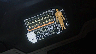
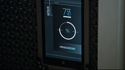
The requirements for a science fiction interface are uniquely different from the interfaces we use every day. In some examples, they are suspiciously effortless; in others, they're unusually complex. Take, for example, a control panel from the Star Trek episode, The Doomsday Machine.
In the first clip, Mr. Scott uses a control panel to play a captain's log entry. In the second, captain Kirk uses that same control panel for impulse engine control. That makes for a rather complex multimodal interface. (Ignore the intense acting in clip 1)
Control Panel A
Later in the episode, we get a clear idea of what this control panel looks like ( See Control Panel A ). It's a simple layout, with rotary switches, a micro-tape port, and few sets of push buttons.
If we redesign the control panel to fit all the narrative elements and consider some basic usability constraints – in that a button for log playback probably shouldn't also control the engines – we get a much more complex control panel (See Control Panel B).
Control Panel B - Redesign

One side effect of adding real-life constraints to this fictional Star Trek control panel is that we start to lose the most valuable science fiction component: abstraction.
Abstracting an interface's style, components, or controls helps us depart from our real-world expectations and take in the new information without judgment. This is apparent when just about anything goes wrong with a system in any science fiction movie, ever.
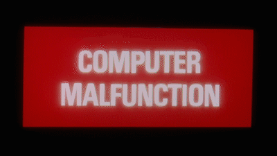
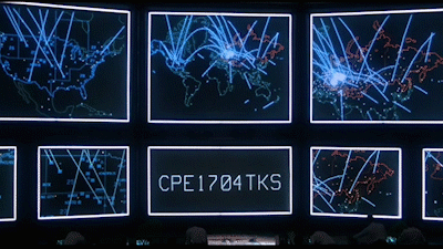
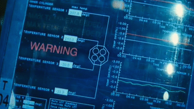
From Fritz Lang’s Metropolis (1927) to The Martian (2015), sci-fi interfaces utilize large sweeping gestures for information and visuals, declarations that tell the audience exactly what they need to know. In the case above: something has gone wrong. In these examples, interfaces and signifiers have been abstracted down into commanding prompts that help the viewer ingest information quickly. This reduction becomes much more apparent when we give an existing interface a sci-fi-style alert.
Movies Above - Metropolis (1927), Forbidden Planet (1956), 2001: A Space Odyssey (1963), War Games (1983), Sunshine (2004), Oblivion (2013), Ex Machina (2015), The Martian (2015)
Mail Offline
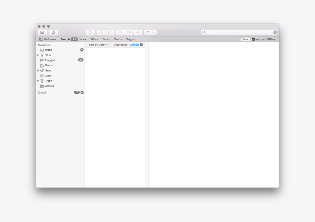
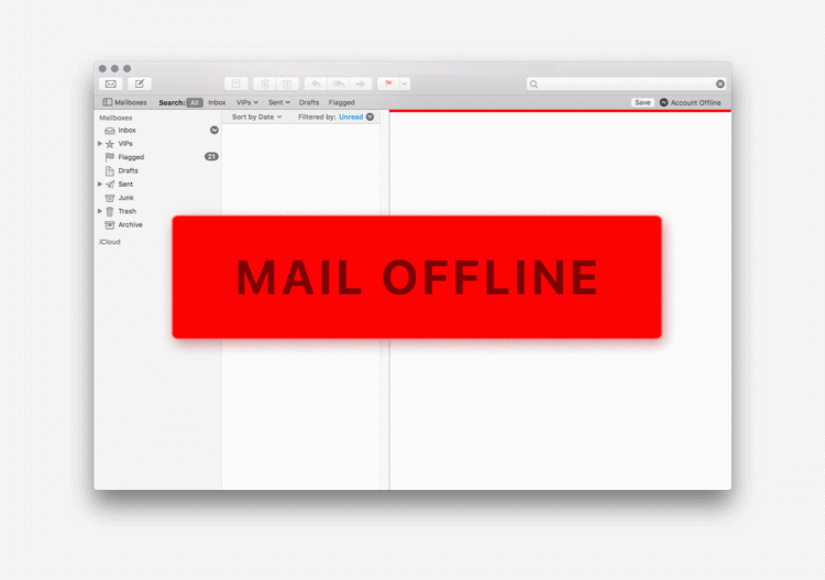
In the first image, we have an offline Mac Mail application. There are subtle monochrome icons that indicate the account is offline. They are effective signifiers; however, they take a few seconds to read and do not stress urgency or action. The second image, complete with a sci-fi treatment, takes offline email from an inconvenience to a pending catastrophe.
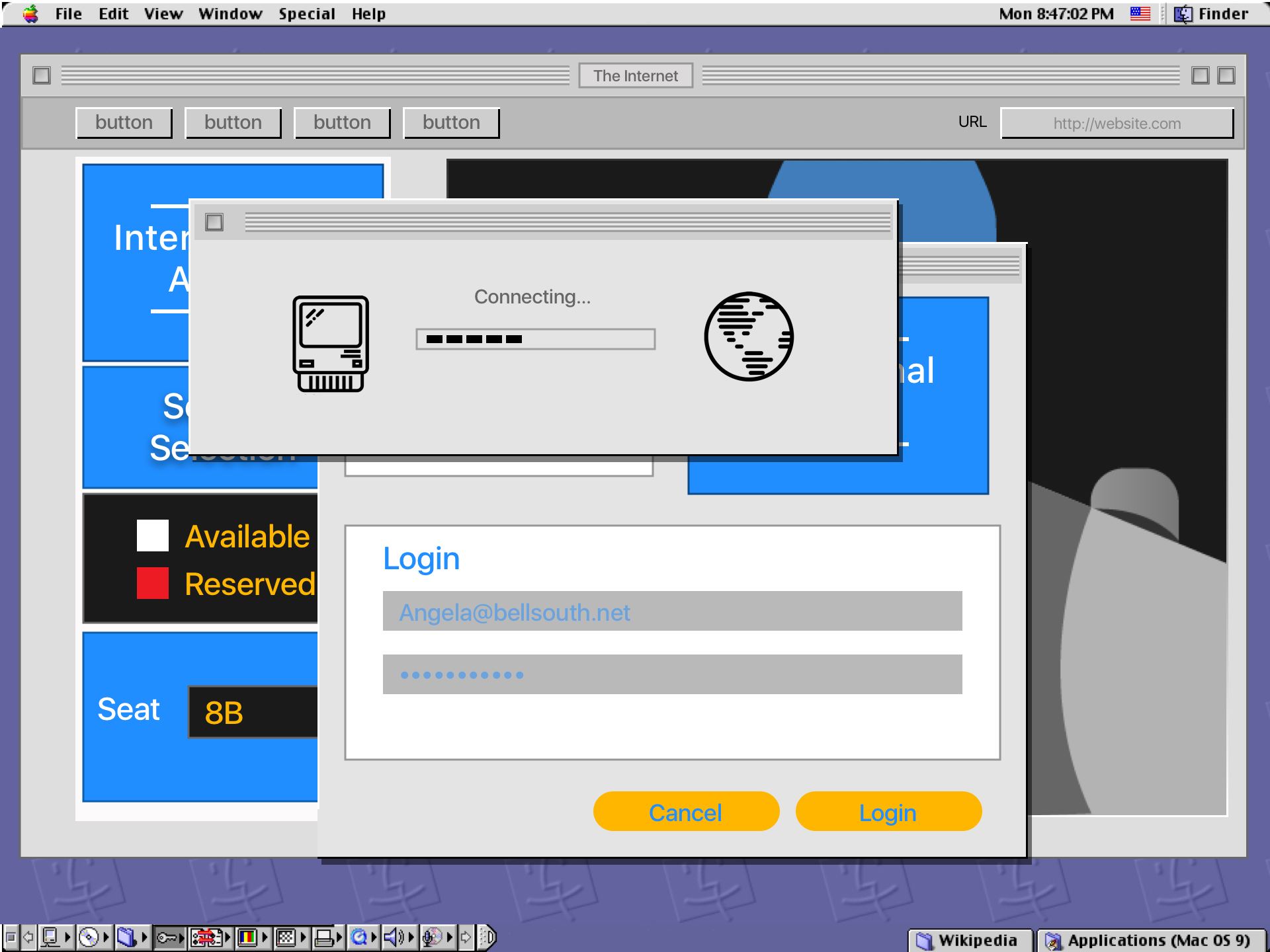
While interface abstraction can help get a warning or alert across quicker, it can also help sell a conceptual technology. A great example of this can be found in the hit ( my words ) 1995 movie, The Net.
The Net - (1995)
It took Angela Bennett (Sandra Bullock) two clicks to book her airline ticket. This is compelling as in 1995, the only way to book an airline ticket was by phone. At this moment, Angela illustrated a beautiful – while idealized – key moment of a conceptual technology.
In the name of science, let's flesh out the screens we missed: Connecting through dialup, updating credit card info, and clicking through advertisements.
The Unfortunate Reality
I wanted to learn more about how to apply lessons from science fiction to a practical interface, so I sat down with the wonderful Christopher Noessel, IBM’s Global Design Practice Manager, and author of, “Make it So: Interaction Design Lessons from Science Fiction” for a chat about movies, design, and sci-fi.
Chris informed me that for actors, working interface prototypes can be distracting in the scene. Most often, an actor creates the gesture in the moment and an interface is later clothed around the input. This is why sci-fi interfaces have extra large button targets and swipe areas.

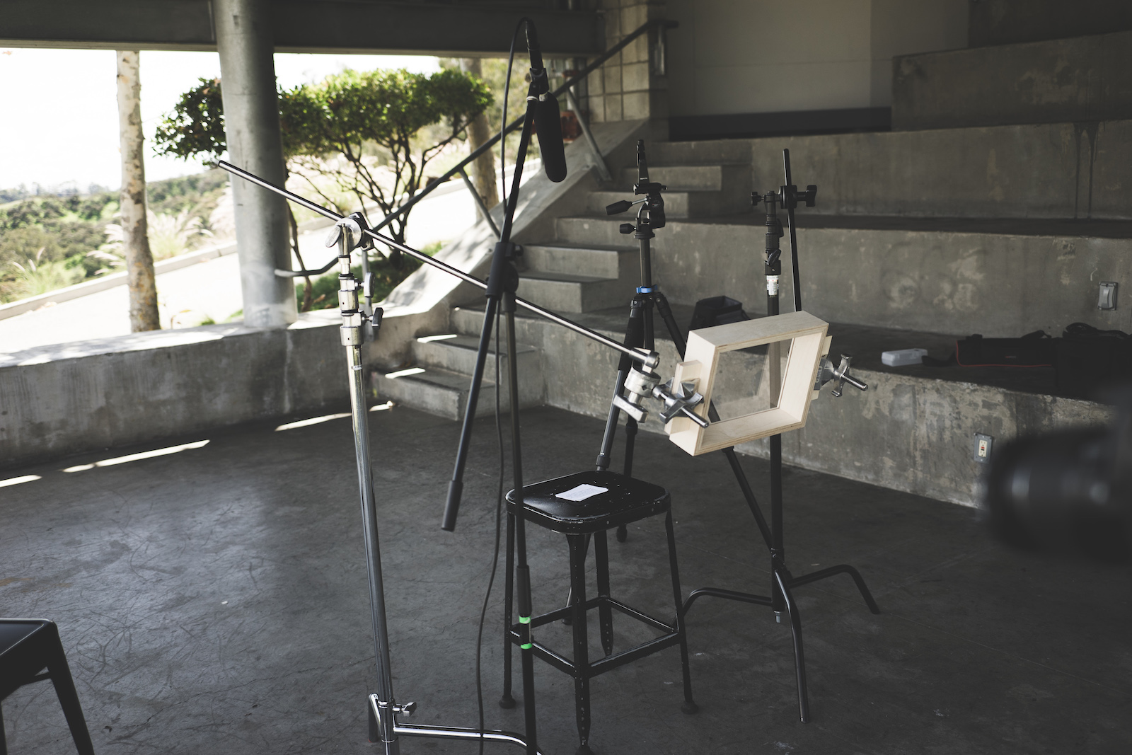
This idea that someone makes an interface by their impulse reaction inspired me to develop a fun play test to see how users would respond to a specific task with no screen information. I made a screen out of plywood and acrylic, and setup three cameras with one placed in front of the acrylic panel.
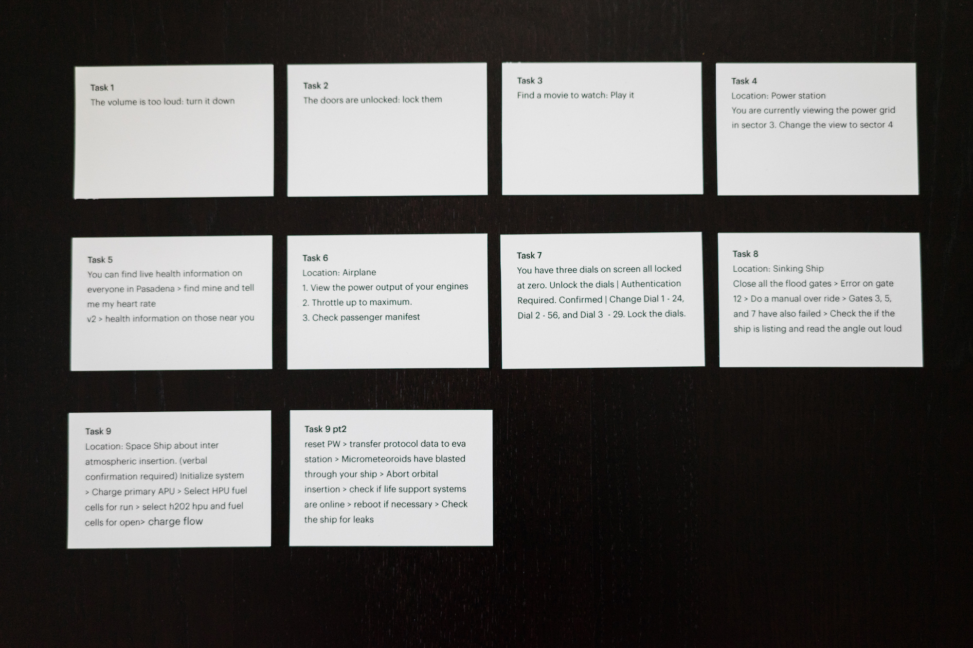
I developed nine tasks to prompt users on the screenless screen. I did not give details as to what was displayed, and encouraged people to go with their first instinct. The tasks started with basic commands and then moved into more complex interactions.
Task: Turn the volume down
It was fun to see how people would accomplish the various tasks. In the videos you can also spot handedness and assume at what OS people might have. It’s clear our phones gestures have created a new language for input.
Task: Turn the volume down - Animatic