Project Brief
KBA challenged each student to create a family of five banknotes, front and back, with a strongly connected narrative throughout the banknote series. They encouraged us to consider printing constraints and security features. We were not required to consider a country or area with our concept topics.
Final Concept - The Laika Series Phase 1
After seven weeks of research and concept ideation, I decided on the topic of Space Exploration. The subject is universal in nature, fits on a timeline, and promotes the ingenuity of humanity. It could also remind us to keep looking up.
* Numbers in concept banknotes are swapped for security reasons: 100 = 001
Components
UV
UV layers are not a machine readable security feature. They exist as an aid for a user to detect a banknote's legitimacy. Unfortunately, most UV attributes are so arbitrarily incorporated that users are often fooled by well placed highlighter marks.
I thought utilizing the blueprints of the featured space vehicle could give a user something more exciting to analyze, and perhaps a better understanding if a banknote is counterfeit.
UV Layer - Blue Print
Full Family - Front
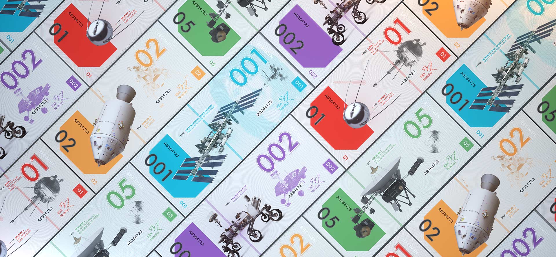
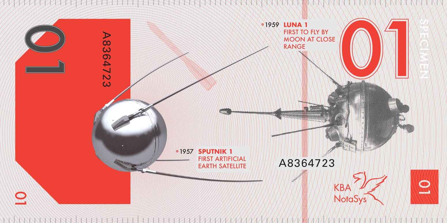
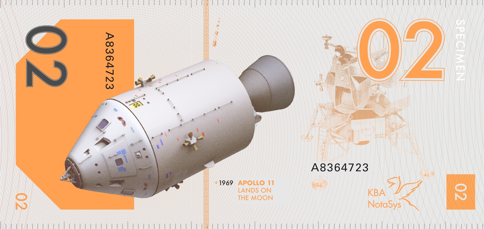
Instead of incorporating portraits, I prioritized the various space probes and vehicles that have allowed us to explore our solar system – each one displayed in a linear timeline starting with earth's first artificial satellite, Sputnik.
Front - Exploration Vehicles
Full Family - Back
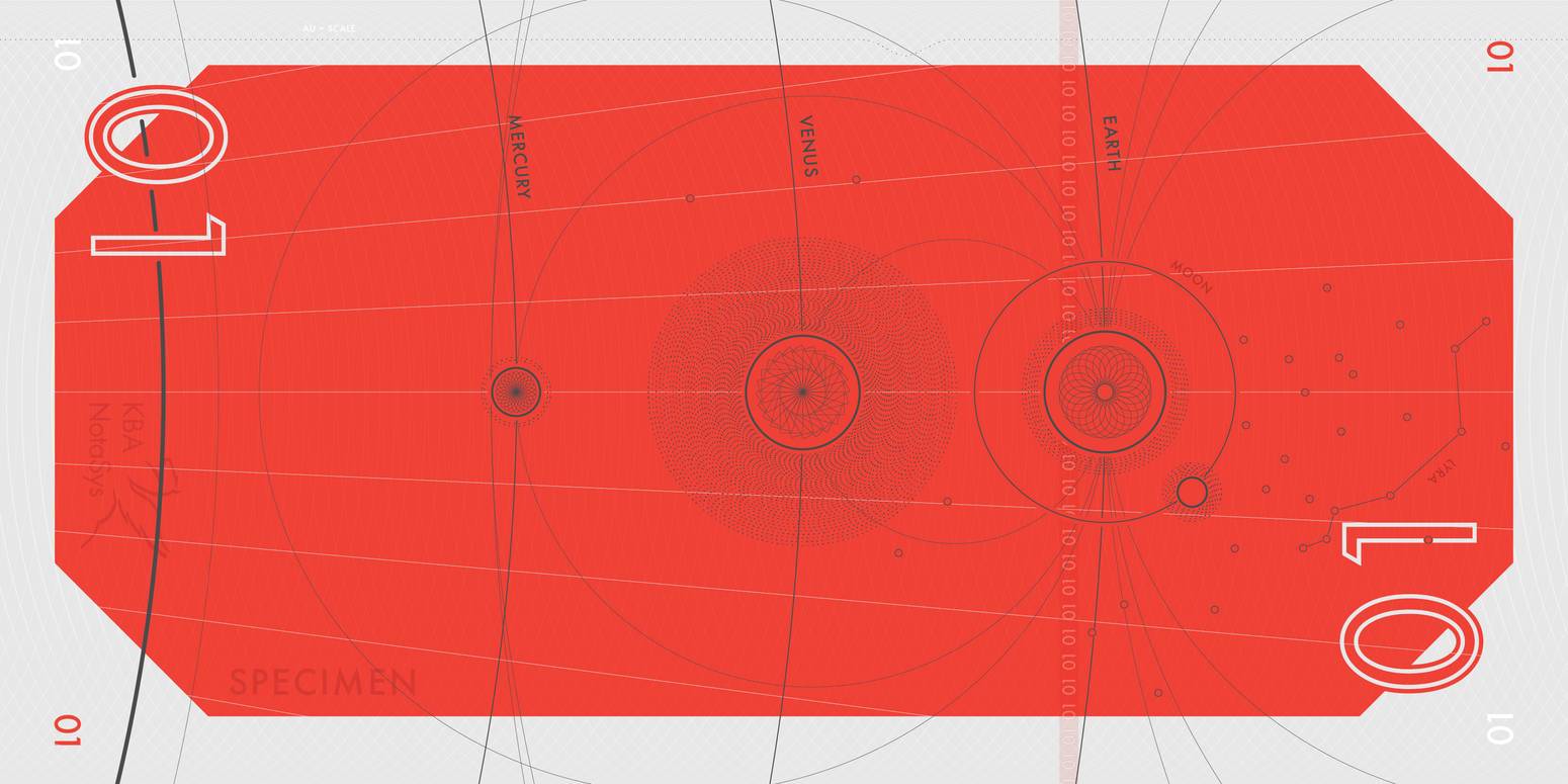
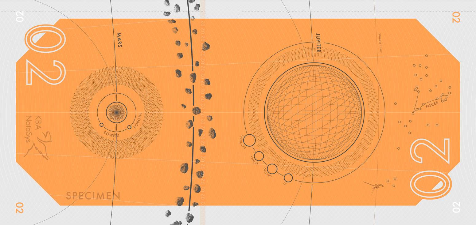
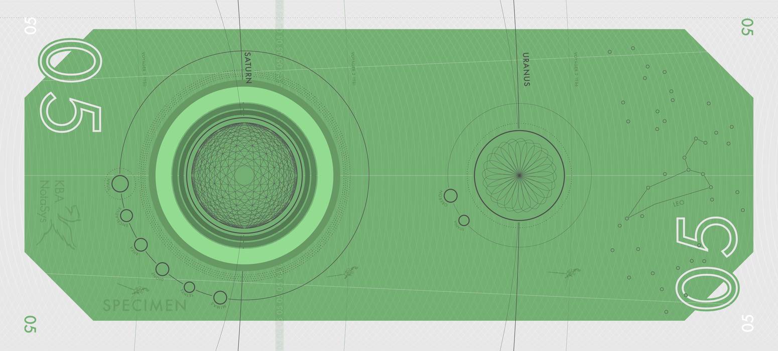
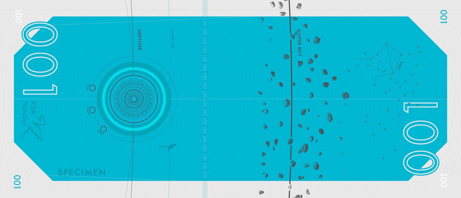
The back features a logarithmically scaled solar system with radial waves illustrating where humans have explored. Voyager 1 and 2 can also be found with the date of their arrival to their various celestial destinations.
Back - Scaled Solar System
Connections
Finding a Style
Part of what drew me to focus on space vehicles was the flexibility at which they can be reproduced graphically. A single engraved portrait can take very talented artists and engravers months to produce. I knew it would best if I didn't burden the viewer with my take at an engraved portrait.
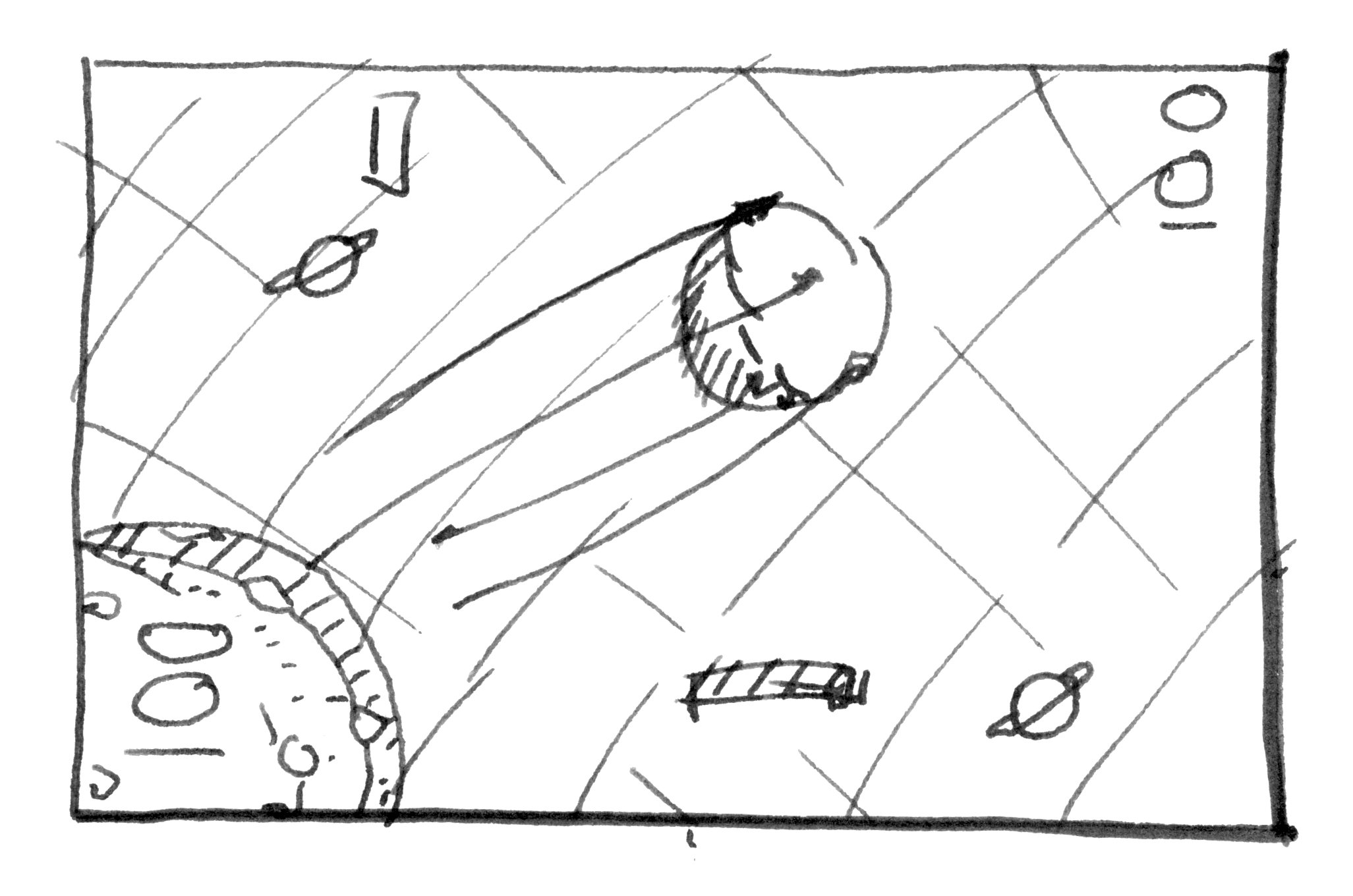
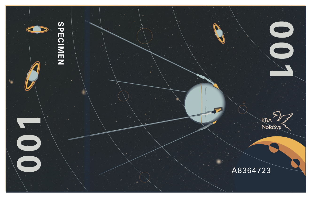
3D Models
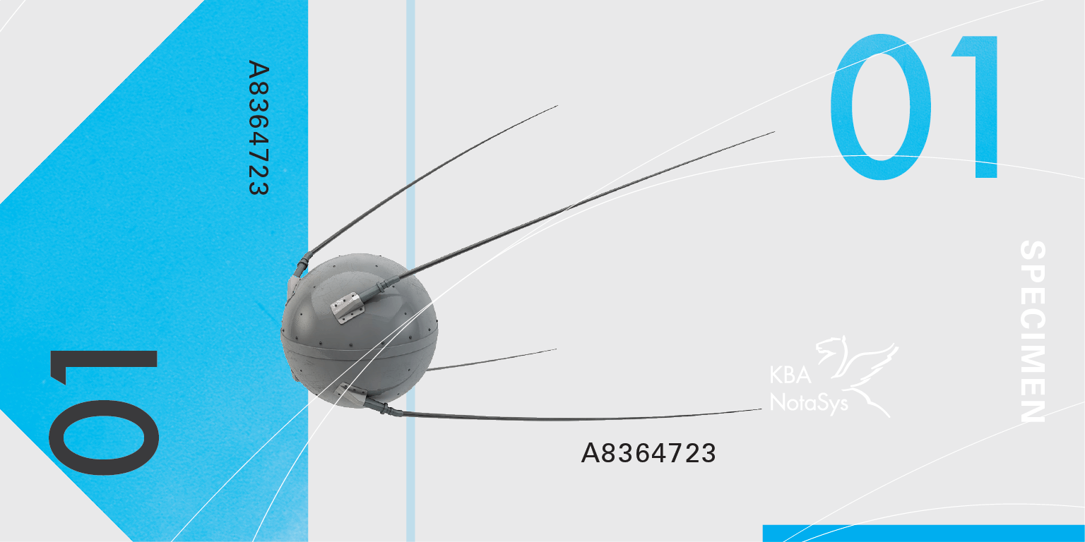
Part of what makes a banknote family feel coherent is a unified level of graphical fidelity. To attain this I knew I needed to be able to control the resolution, style, and positioning of the various space vehicles. 3D models not only allowed me to achieve a consistent style, but also opened the possibilities of digital interactions down the road.
Banknote - 01

Banknote 01
The Russian space probe Sputnik is the primary space vehicle featured along with information of its launch. Sputnik orbited the earth 1,400 times which lead to the incorporation of radial waves that make their way into the next denomination. Next to Sputnik is Luna 1 which launched in 1959 toward the moon. Sputnik's launch vehicle, the R7 rocket, is featured as a watermark.
Banknote - 02
Banknote 02
The Apollo 11 lunar command module is the featured vehicle, while the lunar lander is the secondary vehicle. The Saturn 5 rocket is used as a watermark.
Banknote - 05
Banknote 05
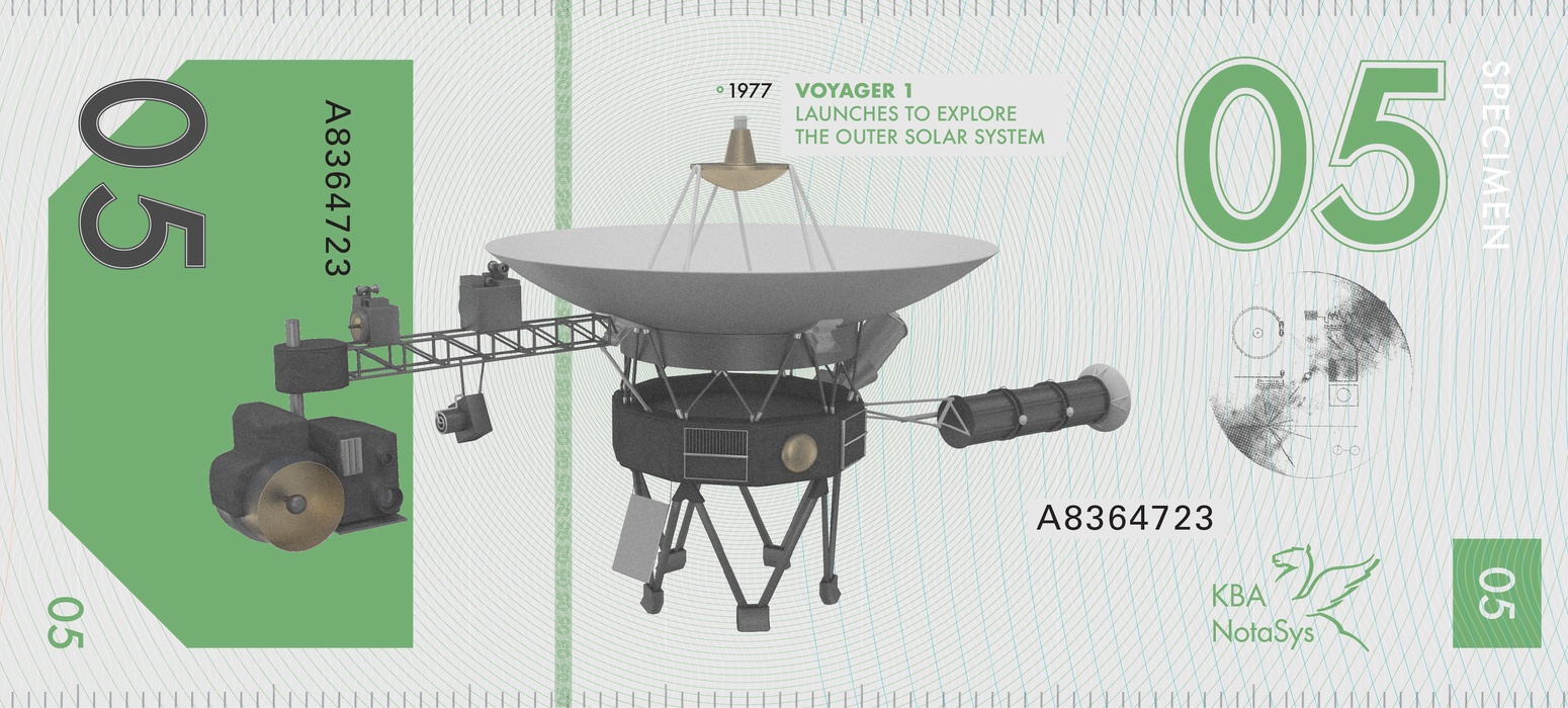
Second to launch but first to leave the heliosphere, Voyager 1 makes the featured vehicle while the Golden Record containing sounds and images of earth and humanity is used as a metallic security component.
Banknote - 001
Banknote 001
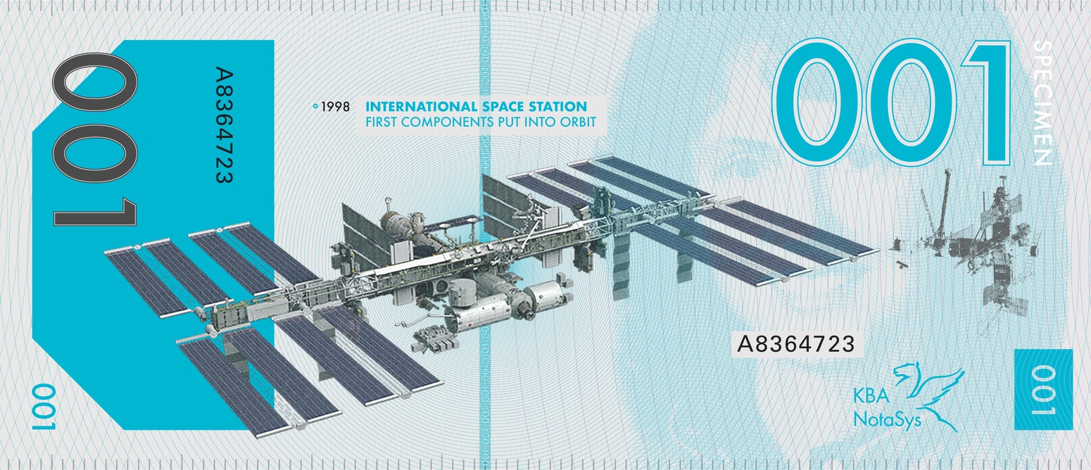
The international space station joined by Russia's modular space station, Mir. The portrait is of Christa McAuliffe, the teacher in space that was killed when the space shuttle Challenger disintegrated on launch. I featured Christa as the main portrait of the series because of the sacrifice she made for education. Growing up my teachers spoke about her with great pride as she represented the courage and dedication the sharing of knowledge can take.
Banknote - 002
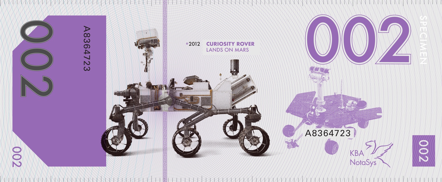
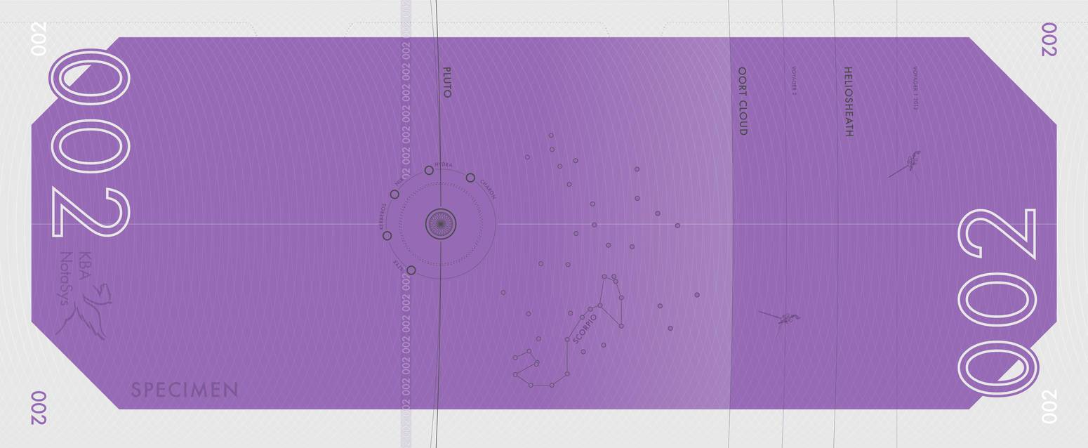
Banknote - 002
2012's Curiosity rover joined by 2004's Opportunity represents the new frontier of exploration and the potential future of Mars.
Numbering
Usability
Designing a banknote is a unique process because everyone in the world needs to be able to use it. I used bold color separation to aid those with low vision, increasing denomination sizes to help with tactile identification, and redundant numbering systems to increase readability from every angle and while counting.
IP Purchase and Internship
KBA purchased my final design concept and awarded me an internship at their offices in Lausanne, Switzerland. During the fall of 2017 I worked in Lausanne on the second phase of the Laika series (not shown here for IP reasons). My final design is to be printed as a concept series and unveiled in 2020.
I will be joining my design lead, Hervé Guillerey, at the 5th International Banknote Designers Conference in Lisbon, Portugal where I will present the evolution of the series and what I learned while working with such a talented team of currency designers.
Lausanne, Switzerland

Tools Used: After Effects, Cinema 4D, Illustrator, Octane Render, Photoshop
